 |
Thirteen...covers of mine, and why I love them 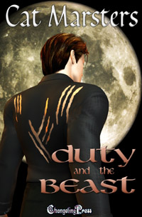 1. Duty and the Beast, Changeling 1. Duty and the Beast, ChangelingThis was a hard one to figure out, cover-wise. Sofie, the heroine, spends most of the book being terribly repressed and wearing awful business suits. Finn, on the other hand, isn't your typical burly alpha male--he's Elvish, quite slim and spry, and not conventionally good-looking. His appeal is all in his personality, his enormous charisma. So I didn't want a direct full-face shot of him, I wanted something a little more ambigious. I love the claw marks on his back--since Sophie accidentally gouges him on more than one occasion--and that gorgeous, luminous moon in the background. Simple, yet effective.  2. Unholy Trinity, Changeling 2. Unholy Trinity, ChangelingI'm always being told that menage books sell best (and my royalty figures bear this out!). But I find it hard to come up with a situation where the polyamory actually works from an emotional point of view, and isn't just a couple with a gratuitous third person thrown in. In Unholy Trinity, there's a Master vampire, a fledgeling vampire, and a human, and they're all locked together, all needing each other for different reasons. While Rafa, the Master, might be the archetypal Alpha, when it comes to the bedroom he's no more in charge than Paige or Jamie. In fact, it's often Jamie, the human, taking care of the other two. So what I wanted here was something to show that the three of them are equal partners in their trinity. A forearm brace like this is a symbol of strength, plus it avoids the cliche of a clinch cover (snigger).  3. The Twelve Lies of Christmas, Samhain 3. The Twelve Lies of Christmas, SamhainNow, for something completely different. This is a romantic comedy suspense (I do like to mix my genres), set just before Christmas, featuring a spy and a con artist. While most of the gun stuff happens with Nate, the hero, not Sam, the heroine, I rather like the idea that she's standing there with his gun--which is so personal to Nate that he named it--as a sort of image of trust. She looks a lot like Sam, too, slender and glamorous. The black background is nice--darkens the tone, because it is after all a suspense.  4. I, Spy?, Samhain 4. I, Spy?, SamhainNow weren't we just talking about glamour? See Sophie here with her lipstick and her evening dress--that is actually from a particular scene, but for the most part, she's distinctly unglamorous. It's sort of a function of her life. However, there's a limit to the realism you can have on a cover. Do I really want a girl who's a couple of pounds overweight, needs to retouch her roots, and gets blisters from high heels on my cover? No, I'd rather have the glam chick in the red dress. And since it's a cartoon cover, then she can look like Jessica Rabbit without censure. The other thing I love about this cover--well, one of the other things--is the font. It's got that sort of digital, techo-spy look about it. Helps clue you in that she's not just a blonde in a red dress. The basic requirement I had for these covers? I told the cover artist (Scott Carpenter, who deserves more praise than he gets!) to 'make it too much, then make it more'. Yes, it's pink. But it needs to be PINK. Bring it on.  5. Ugley Business, Samhain 5. Ugley Business, SamhainSophie again! Again, looking glam. What I like here is Luke, and how he's charming Sophie with a rose in one hand, while the other holds his gun. This book picks up where I, Spy? left off, where Sophie and Luke had a 'happy for now' ending, and haven't really got far past it. Is it just sex? Is he trying to charm her? Why does he get to be good with a gun when she doesn't know how to work hers? Plus, I haven't mentioned the background yet. I LOVE these backgrounds. It was one of the things I mentioned in the cover request, that I wanted something to unify the covers and make them look like a series. This way, you can mess around with fonts, colours, and images, but with that striped background there's something to tie them all in. I got the idea for the stripes from the Hustle credits, incidentally.  6. Sundown, Inc., Changeling 6. Sundown, Inc., ChangelingAh, my first print book! See, here I am, holding it! We had some debate over which of the four Sundown covers to use on the anthology. My favourite was, and still is, She Who Dares, but we decided that with a title like Sundown and a girl with a stake on the cover, people might think it was a vampire book. And while there are vampires in it, only one story focuses on them. The thing is, I know vampires are popular. I know some people will go out and buy a book just because it promises fangs. But then I also know how uppity readers can get if they've spent their precious pennies on something that's not what they expected, and I know some of them aren't above flaming an author publically for misrepresentation, and we all know how authors can't fight back against criticism because People Have The Right To An Opinion, You Know. I am of course referring here to people, not to authors. Who don't have any rights. Anyway. Rant over. We couldn't use the She Who Dares cover for that reason, and my second choice, Blue Moon, didn't leave enough room for the text necessary on a print book cover (which I think needs slightly different proportions from the e-book version). So, we picked the What Wizards Want cover, which is, I think, the most intriguing one. Is that a girl in a fishing float? Why is she in a fishing float? How did she get in a fishing float? Et cetera, et cetera.  7. A is for Apple, Samhain 7. A is for Apple, SamhainI LOVE those stockings. I WANT those stockings. Isn't she a sexy chick? Don't those stockings and heels tell you she's the girl in charge, here? This cover was slightly tricky, because Sophie spends half the book in New York City, being a spy, and half the book at school, pretending to be a teenager. But anyway, both of those provided me with a useful apple theme, which I'm delighted to see Scott used here on the cover. That's Scott Carpenter, by the way, who's done all my Samhain covers so far and I really hope he continues to do so, because he's absolutely nailed them. I like the shady guy in the background, too. He could be anybody. He could be Luke, or he could be Docherty, who is pretty shady. Or he could be any one of the other shady men in suits in the book. There are plenty.  8. East Side Story, Changeling 8. East Side Story, ChangelingAnother cover with a difficult birth. Well, actually, the real problem was that I went way past deadline with the story, and all the blurb and cover things got rushed as a result. Poor Renee George got a rather stressed cover request from me, but she did it brilliantly. It is of course modelled on those West Side Story posters, with the dance motif and the blocky text. The hardest part here was trying to figure out what, if anything, they should be wearing, since both of them pretty much spend the book naked, apart from Maria in her sequinned dress and Ruarc in the ridiculous outfit the Unseelie Queen gives him. Here, you can't see if he's wearing anything at all, but you can see his wings, which are in the right sort of cool tones for a winter fae. I love the mist rising, too, like steam from the subway grates in Manhattan. 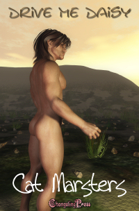 9. Drive Me Daisy, Changeling 9. Drive Me Daisy, ChangelingA new cover! Very hot off the press. What I was going for here was a scene that's mostly in flashback. The bulk of the story takes place in America, but the hero and heroine first met in Australia, when the faeries ejected her into the mortal realm at a weak spot between our world and theirs. The one they picked was Uluru, or Ayers rock. The hero's werewolf pack find her there, and take her in. The hero in this book is based on Hugh Jackman--those burly arms, and that smile! Oh, that smile... ahem, anyway. I think Fab did a great job on capturing him here, and the lighting is just gorgeous. 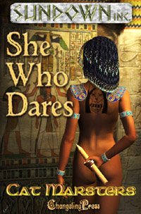 10. She Who Dares, Changeling 10. She Who Dares, ChangelingMy first cover, and still one of my favourites. It's so crisp and clear, and the colours are so warm. It really draws the eye. The figure here is the heroine, Masika, and this is almost exactly taken from a scene at the end of the book where she attends a masquerade dressed in her Egyptian collar and bracelets, and not much else. The tattoo is one I drew on a piece of paper and sent to Bryan, the cover artist--it's a tribute to Bast, the goddess Masika worshipped in life. The background of course is a clue to the era she lived in. Finally, the stake, which is a tool of her trade. Masika's a vampire, but she's also an assassin, and her current prey is the hero of the book, Dare. 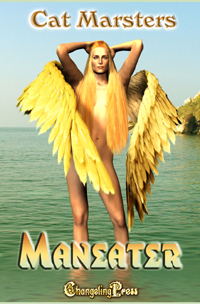 11. Maneater, Changeling. 11. Maneater, Changeling.I love this cover. Sahara Kelly captured Chloe perfectly. She's a siren, a real prpoer Greek siren, the kind Odysseus faced. In the book, she flies on golden wings--she can actually change her form to a giant eagle with a human head, but I figured this might be a little too weird for the cover! Instead we've got her (mostly) human form, in which she's completely physically perfect. Yeah, I know, we all have our crosses to bear. The other thing that's gorgeous about this is that background. Don't you just want to dive into that sea? Don't you know it's warm and clear and lovely? I guess it's like Chloe herself: too good to resist.  12. Almost Human, Ellora's Cave 12. Almost Human, Ellora's CaveI'll let you in on a secret: I hated the first draft of the Almost Human cover. My wild and rugged leonine hero had a neat short-back-and-sides and my white-blonde heroine had dishwater dull hair. She was supposed to be glamorous, beautiful, elegant, and she looked like a dishwater blonde with no makeup on. Not good. Anyway, I got the cover re-done. The hero, Dark, is of a race that can take an animal form, and his is a huge lion with a dark mane. I wanted his human appearance to reflect this, with a mane of dark hair and whiskers on his cheeks. To me, he looks a lot like Hugh Jackman as Wolverine. He's very dark and growly, too. As for Chance, my heroine, I did worry that she looked a little like a pornstar, and then I reminded myself that she's actually a courtesan, and she has sex for money. As for the knives they're both holding, they're a little shadowed but they get the message across: he wants her dead and she's not going to go down without a fight, even if they both desperately want each other naked. 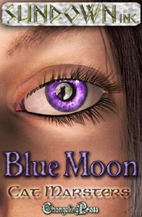 13. Blue Moon, Changeling. 13. Blue Moon, Changeling.This is one in the eye (pun intended) for all those people who reckon Poser is unrealistic. This is very nearly photo-quality, it's just gorgeous. Once again, with this cover I didn't want a full-body shot, because Magda, the heroine, wears a lot of suits and pearls and things. I guess we could have had Elek, but I wasn't sure Poser could quite convey the incredible beauty of this man with his soulful dark eyes. In my head, Elek is Orlando Bloom in Kingdom of Heaven. Beautiful, beautiful man. So here we've got Magda, who doesn't actually have purple eyes but that's artistic licence for you. I really love the reflection of the wolf in the moon--Magda is, of course, a werewolf, and so is her hero, Elek. Good Lord. How did I end up with so many books? This isn't even all of them! |
The purpose of the meme is to get to know everyone who participates a little bit better every Thursday. Visiting fellow Thirteeners is encouraged! If you participate, leave the link to your Thirteen in others comments. It's easy, and fun! Be sure to update your Thirteen with links that are left for you, as well! I will link to everyone who participates and leaves a link to their 13 things. Trackbacks, pings, comment links accepted!
My favorite is the Blue Moon cover. It's realllllllly cool!
ReplyDeleteThese are all beautiful! I can't wait for the day I actually have 13 books published LOL. Congratulations on the great artwork.
ReplyDeleteAll your covers are lovely, but She Who Dares and Blue Moon are absolutely stunning.
ReplyDeleteYou look so young and gorgeous in your picture. :-)
I like the egyptian cover. They should of went w/ it for the anthology. She Who Dares is gorgeous. But I like the Kate Johnson ones too. Very different and the look reminds me of a Agent 007 feel.
ReplyDeleteAwesome covers! Maybe someday I'll have enough to do an entire TT. :)
ReplyDeleteI think She Who Dares is my favorite. I love the Egyptian look! Happy TT.
ReplyDeleteI really like most of them -- especially the Twelve Lies of Christmas! Very catchy titles, too. :)
ReplyDeleteI'm also extremely impressed that you have thirteen covers to show. Keep up the great work!